
Building a Scalable Design System for Fiserv’s Global Financial Products
Problem
As Fiserv scaled globally, inconsistent UI patterns across products caused delays in development, misalignment between teams, and fragmented user experiences.
Impact
Designers spent too much time reinventing components, developers struggled with unclear specs, and brand consistency suffered across platforms.
Role
Lead Product Designer spearheading the creation and rollout of a unified design system across multiple financial products.
Key Responsibilities
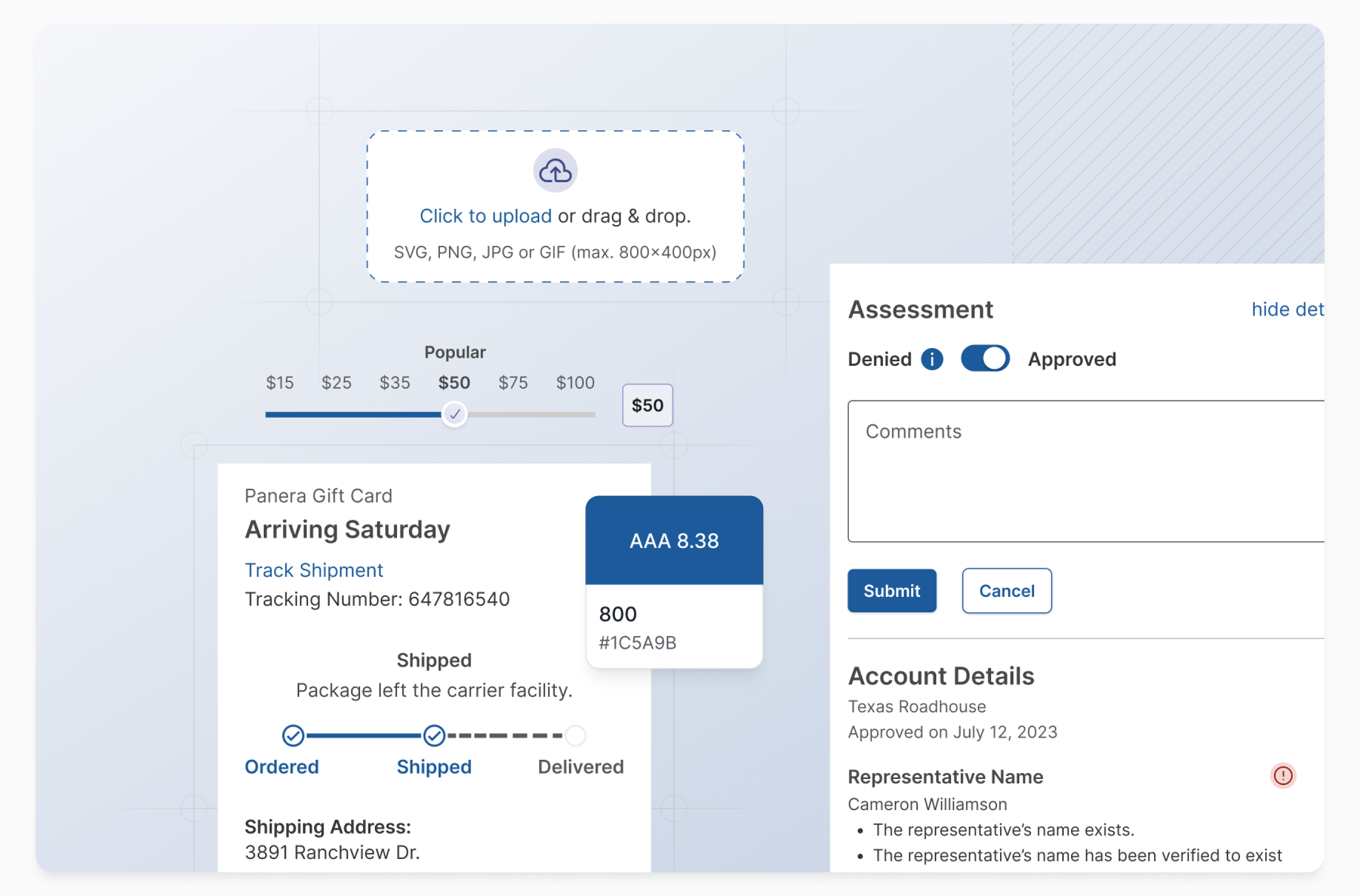
- Defined system architecture using Atomic Design principles
- Partnered with engineers to build scalable component libraries
- Led cross-functional workshops to align stakeholders
- Built adoption strategies and training programs
- Documented everything in Figma and internal knowledge bases
Timeline
May 2022 - Oct 2022 (6 months)
Process Overview
Discovery
Audited existing UI inconsistencies and pain points across 10+ products
Design
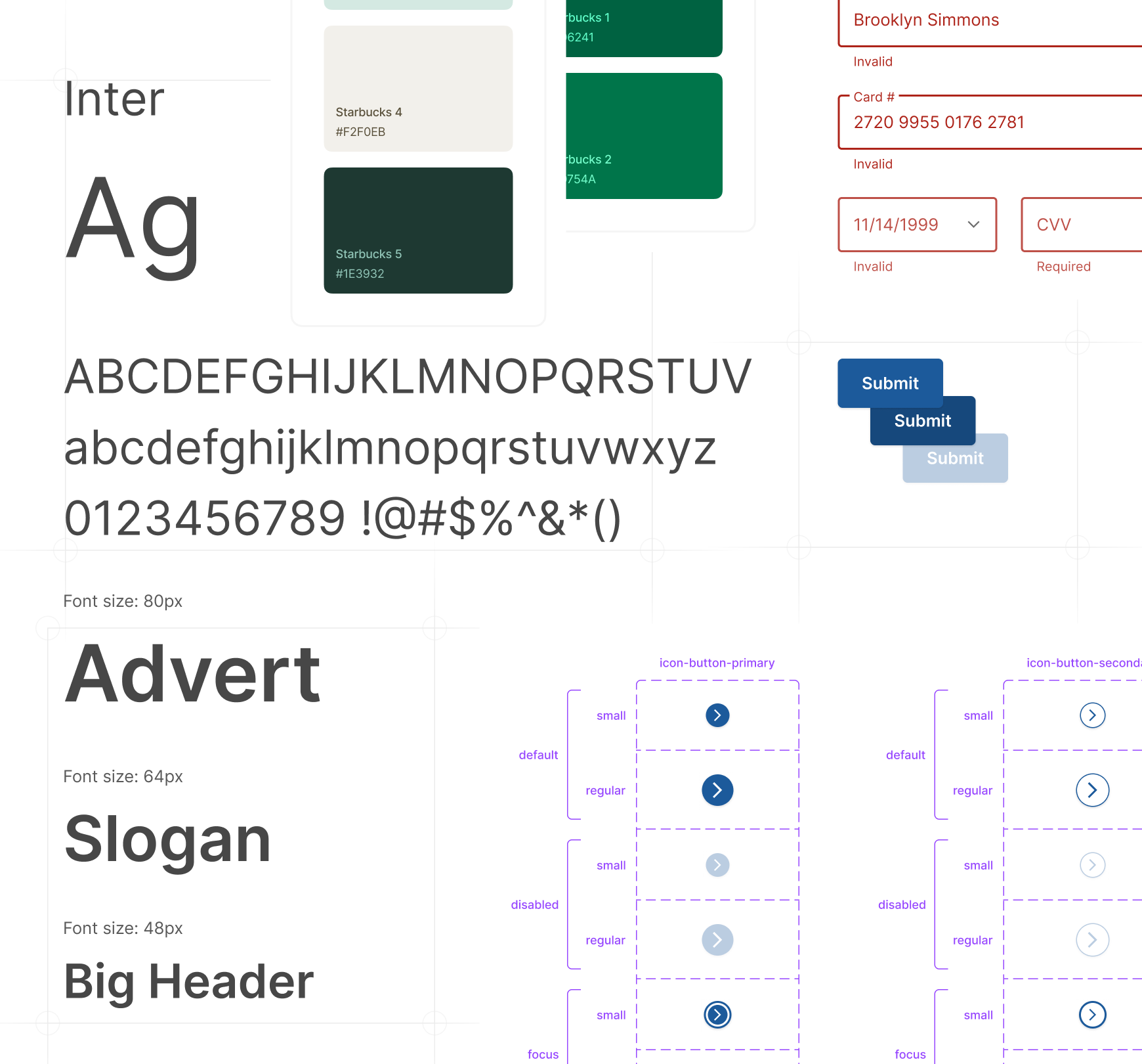
Developed core primitives (colors, typography, spacing) and built foundational components using Atomic Design
Collaboration
Worked closely with front-end engineers to ensure implementation fidelity and maintainability
Documentation
Created centralized documentation in Figma
Adoption
Produced training sessions, created internal champions, and tracked usage metrics
Design Principles
Clarity
Clean interfaces for complex financial tasks
Efficiency
Streamlined workflows for high-volume users
Accessibility
WCAG-compliant color contrast and interactions
Scalability
Modular components adaptable across platforms
Foundations
- Color palette optimized for accessibility and global use
- Typography system for readability across devices
- Spacing system based on a modular scale
- Custom icon set aligned with Fiserv’s brand identity
Implementation Strategy
- Integrated into Figma as a shared library with auto-layout and variant support
- Designed tokens for seamless handoff to developers
- Used Storybook for live demos and code integration
Adoption Tactics
- Internal launch campaign with demos and Q&A sessions
- Weekly office hours to help teams adopt the system
- Metrics dashboard showing usage growth and savings
Results
- Reduced redundant design work by 50%
- Cut developer handoff time by 40%
- Achieved 90% adoption across 10+ product teams within 6 months
- Increased team productivity by 30% company-wide
- Improved user satisfaction scores due to consistent UX
What I Learned
A design system is not simply a collection of components, it is a culture shift. There is constant education, evangelism, and feedback required. Establishing trust with engineers early on is key to long-term success. Documenting and tooling are essential in distributed or remote environments.

