Leveraging AI for Smarter, Data-Driven Product Insights and Analysis
Project Brief
The client was a mid-sized tech firm that sought a solution to simplify how small-to-medium businesses analyze their data without requiring technical expertise.
Their primary objective was to empower users to interact with data through conversational, text-based commands, creating an experience that felt more like a dialogue than traditional data analysis.
Role
Senior Product Designer
Team
Product Designer, UX Researcher,
Project Manager, Stakeholders,
NLP Engineer, Frontend Dev,
Data AnalystTimeline
April 2024 (3 weeks)
Empathy
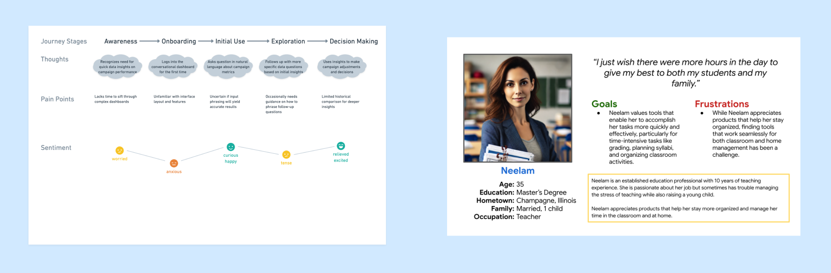
To truly understand the pain points and motivations of end-users, we conducted user interviews and surveys, focusing on how non-technical users perceived current data visualization tools. Through these discussions, we identified common frustrations, such as the steep learning curve of dashboards and the reliance on static reports. This research also revealed users' desire for flexibility, allowing them to ask questions in their own words, without needing to learn specific commands or structures.
Define
Problem Statement
Users faced barriers in accessing and interpreting data, often struggling with dashboards that required technical knowledge. To meet their needs, we aimed to design an AI-driven dashboard that felt intuitive, offered flexibility, and mirrored natural conversation, helping users gain insights quickly and effortlessly.
Key Insights
- Preference for Simplicity: Users wanted a more conversational interface, mimicking everyday conversations.
- Variety in Communication Styles: With varying language habits, such as typos and informal language, users needed a tool to interpret these nuances.
- Desire for Clarity and Guidance: Non-technical users often required guidance through the interface, so including clear signifiers and intuitive navigation became essential.
Ideate
Informed with user insights, we explored multiple design possibilities. We brainstormed how natural language processing (NLP) could best serve users, ultimately deciding on an interface that prioritizes conversational prompts. This setup would allow users to input questions or commands as if speaking to a colleague.
We identified some potential features to explore:
- Conversational Prompts: A responsive text box that accepts diverse language patterns, including typos and abbreviations.
- Visual Hierarchy Resembling Dialogue: Structuring data output to resemble an ongoing conversation for ease of understanding.
- Dynamic Tips and Suggested Questions: Real-time tips to assist users in asking more detailed questions and exploring their data with confidence.
Prototype
First Prototype
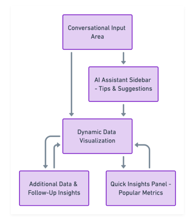
Based on the initial brainstorming, we developed a low-fidelity prototype that prioritized a clean, minimalist layout. The prototype featured a conversational input area at the top, followed by dynamically generated data visualizations. We also introduced an AI assistant sidebar offering real-time suggestions.
User Testing & Feedback
Users appreciated the simplicity of asking questions directly and found the assistant suggestions helpful, though some indicated they wanted more visual clarity on certain responses.
This feedback guided the next iteration’s focus on enhancing visual communication and clarity.
Iterate
Testing and iteration were key components of the Design Thinking process, enabling us to refine our prototypes based on real user feedback.
Revised Prototype Based On Feedback
~ We refined the AI assistant's suggestions and enhancing the color contrast for better readability.
~ We simplified the navigation by consolidating complex data into digestible sections, using a decision-tree model that progressively broke down insights.
Overcoming Challenges
When stakeholders suggested including static, preloaded charts on the dashboard, we faced a significant hurdle. To accommodate this without compromising the conversational flow, we implemented an optional “Quick Insights” section. This section allows users to view frequently accessed metrics while maintaining the primary focus on dynamic, conversational data queries.
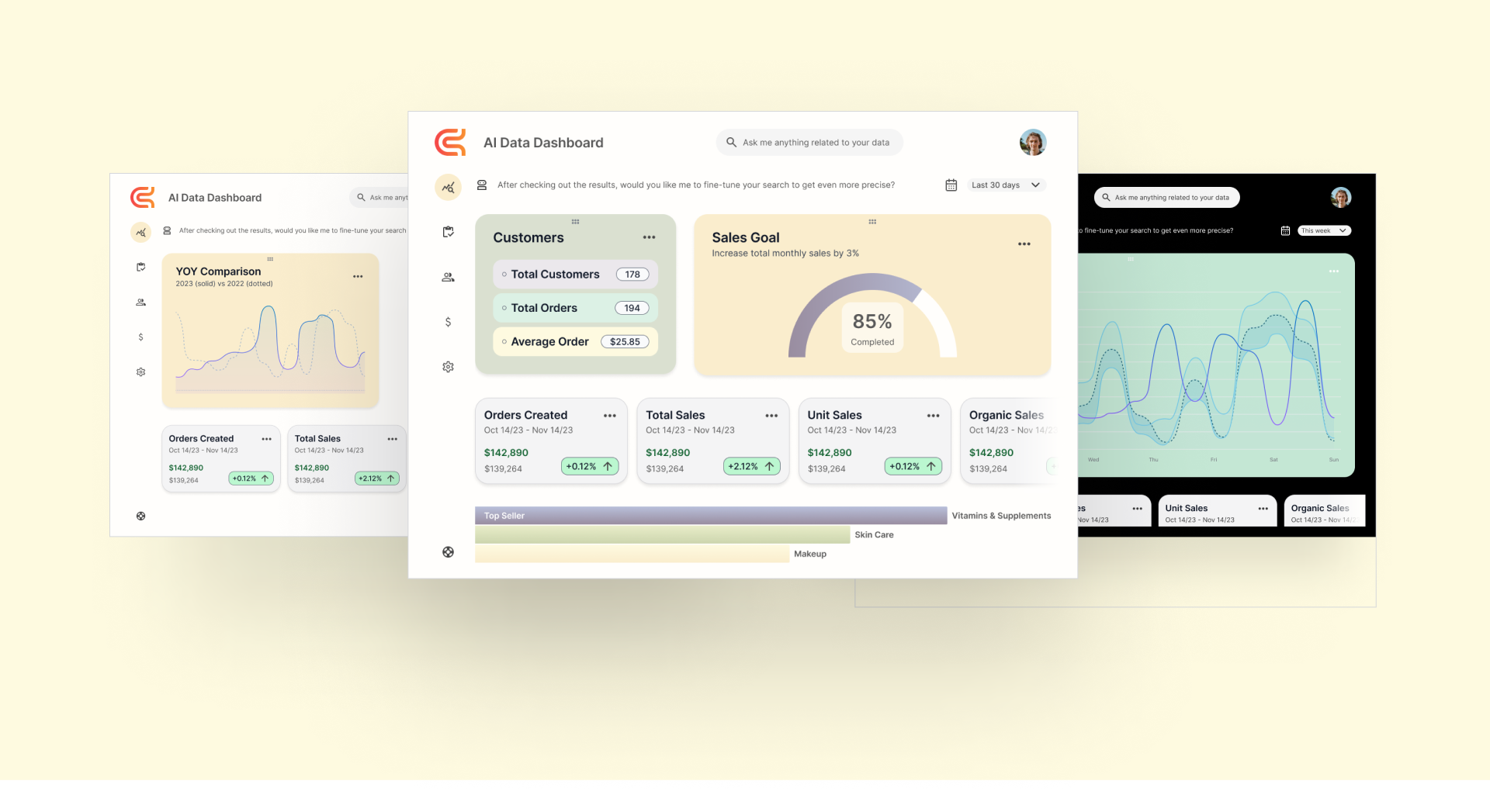
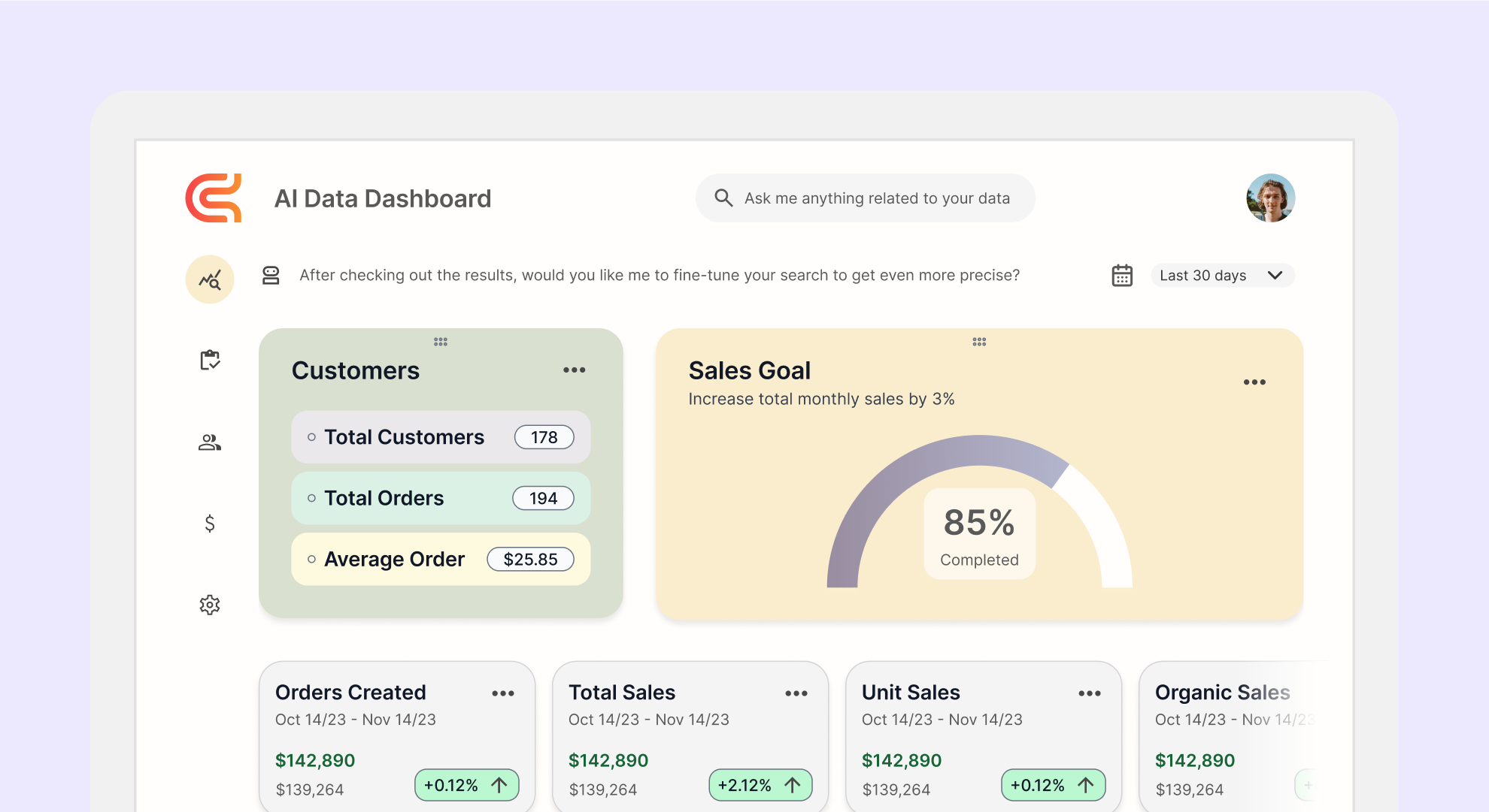
Final Designs
We delivered a powerful, user-friendly AI dashboard that offered an approachable experience for data analysis. The conversational interface allowed users to ask questions naturally, while the improved visual layout ensured clarity and ease of navigation.